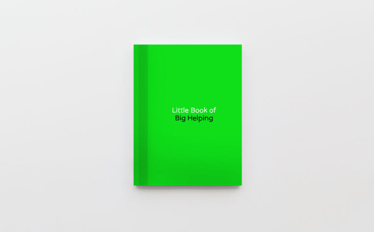
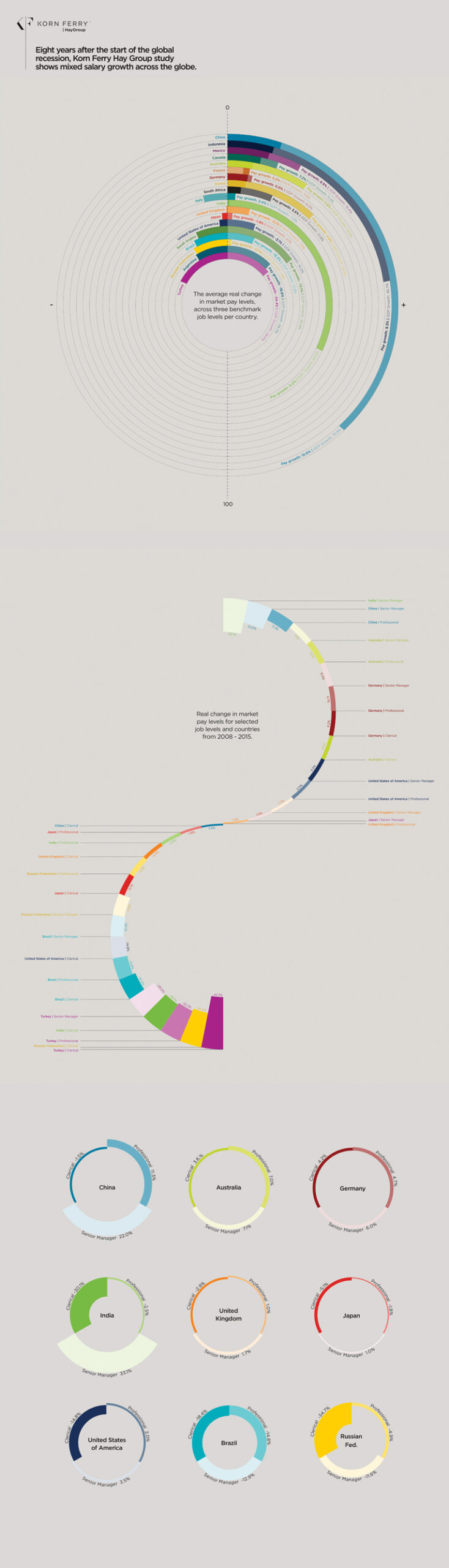
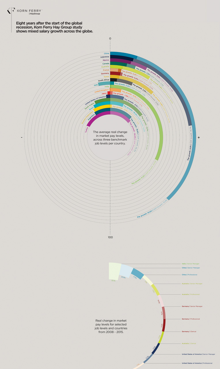
Little book

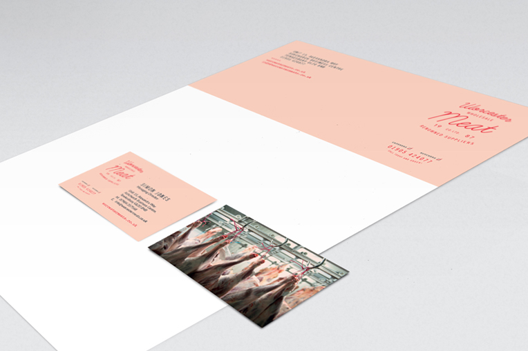
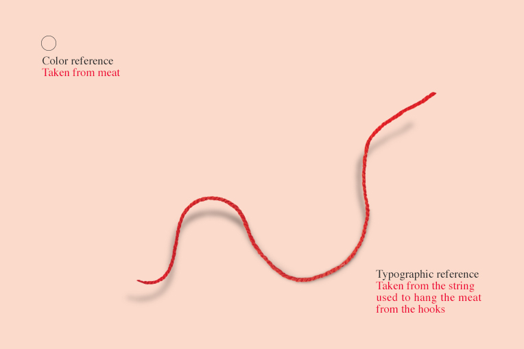
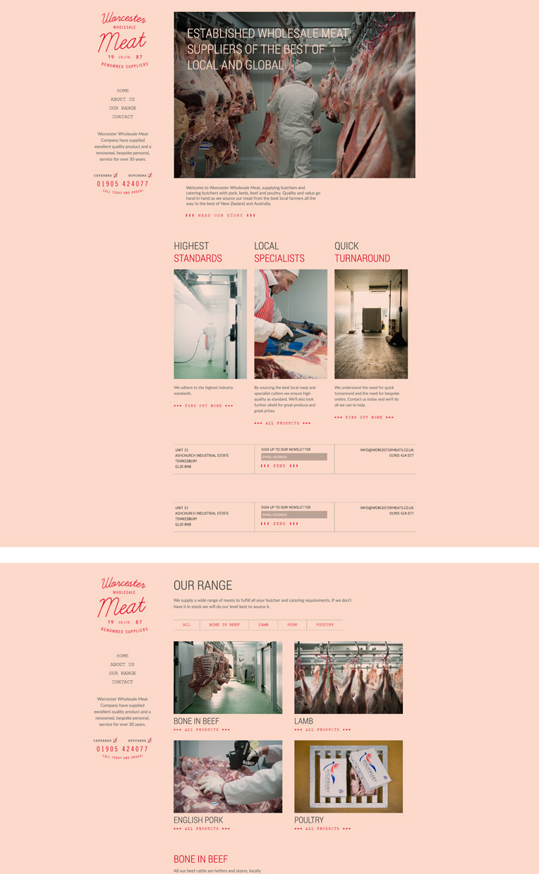
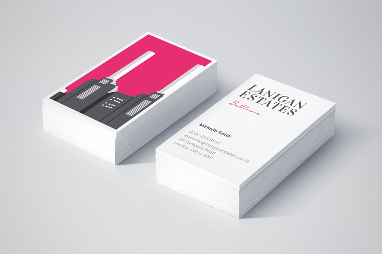
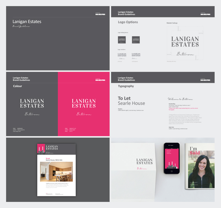
It’s been a long time coming but our Little Book of Big Helping has finally gone to print. Look out for copies in book shops near you… or perhaps we’ll just send you one! We were keen to collate a selection of our work to hopefully wet the appetite for all of you out there who haven’t yet had a taste of Big Helping. We’ll let you know when the book is ready.

Infographic design

Korn Ferry came to us to bring to life a recent report on salary growth across the globe. A set of excel documents came our way! Through working closely with the client we created a set of graphics that portrayed the information in a more appetising fashion and showed the key findings of the report. See the full Korn Ferry story Click here To view the report Click here

Size isn’t everything

Many of you might know we are a sucker for the land of the miniature… Big Helping irony! We recently went to an exhibition of Thomas Doyle’s work and it got all our minds spinning. Complex meanings, beautiful sculptures, truly showing size isn’t everything.  Thomas’ Portfolio

Hay Group

We have enjoyed worked with Hay Group for the last couple of years. Korn Ferry acquired Hay group almost a year ago now and we continue to enjoy a great working relationship with the team there. Although a bit late in the day, we wanted to showcase some of the work we did before the acquisition.

Beautiful work

We are always on the look out for new designers and artists and we ‘love’ the work of Muller Van Severen. His fresh, fun and minimalist style floats many of our boats. Perhaps a purchase for our new office is in order! Muller’s Portfolio

Boo’s Baby Bites

Boo’s Baby Bites, a start up business with a lovely idea to create honest healthy baby food – truly handmade and frozen to lock in the goodness. Initially we worked closely with the client on logo and strapline. Click here for the full brand story.

Not to everyone’s taste

A local meat wholesaler asked us to look at a ‘logo’ – we instead reinvented the brand look and feel from logo to livery. We commissioned local photographer Sara Deakin and were really pleased with the results. The aim has been to look past the blood and see a state of the art facility and a professional team delivering sustainably sourced product. Traditional values with a modern approach.

Estate Agent’s Logo

We have recently completed the rebrand of London based Lanigans Estates. Focused entirely in Battersea and with local knowledge paramount to their success – we kept a personal touch with handwritten fonts, bespoke area illustration and a friendly, contemporary colour palette. The hierarchy of the logo can be altered depending on the market. This project adds to our growing property client portfolio in London and the Midlands.

A thank you to Charlotte

It has in truth been a while since Charlotte left but our official leaving present has only just been completed. Tim’s wool ball technique requires work! Charlotte, we hope it will be a nice reminder of your time here and wish you all the best with your next job and your knitting. It was a pleasure to have you here for your first step up the career ladder.