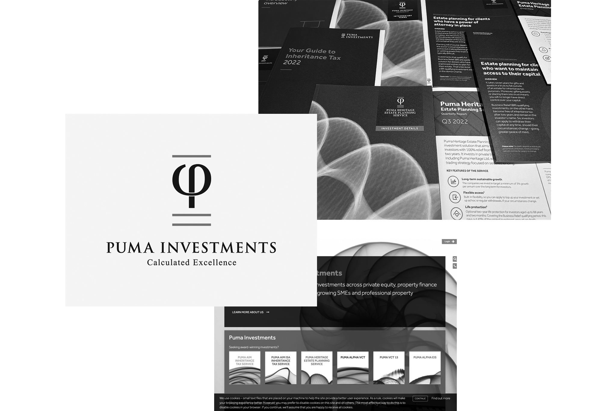
Puma Investments
We were really excited to work with the team at Puma on this rebranding project, primarily as we were given full permission to ‘address’ it all. From tone of voice and messaging through to logo and the full brand library. After extensive research both within the team and externally we realised the focus should be on creating a more premium brand to go with the premium product and service. The current brand was limited and lacked the human feel Puma wanted to emphasize.

The Brief
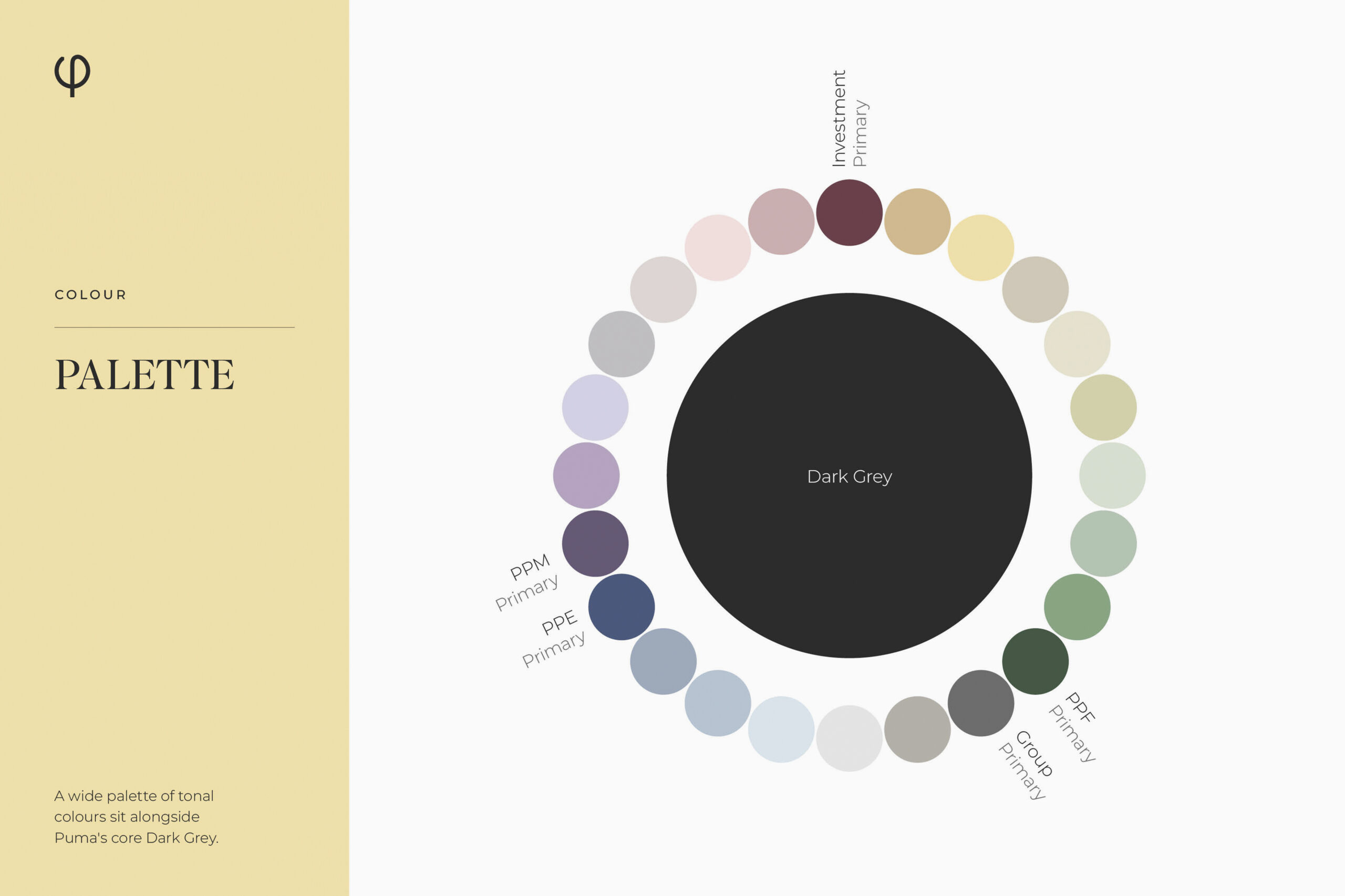
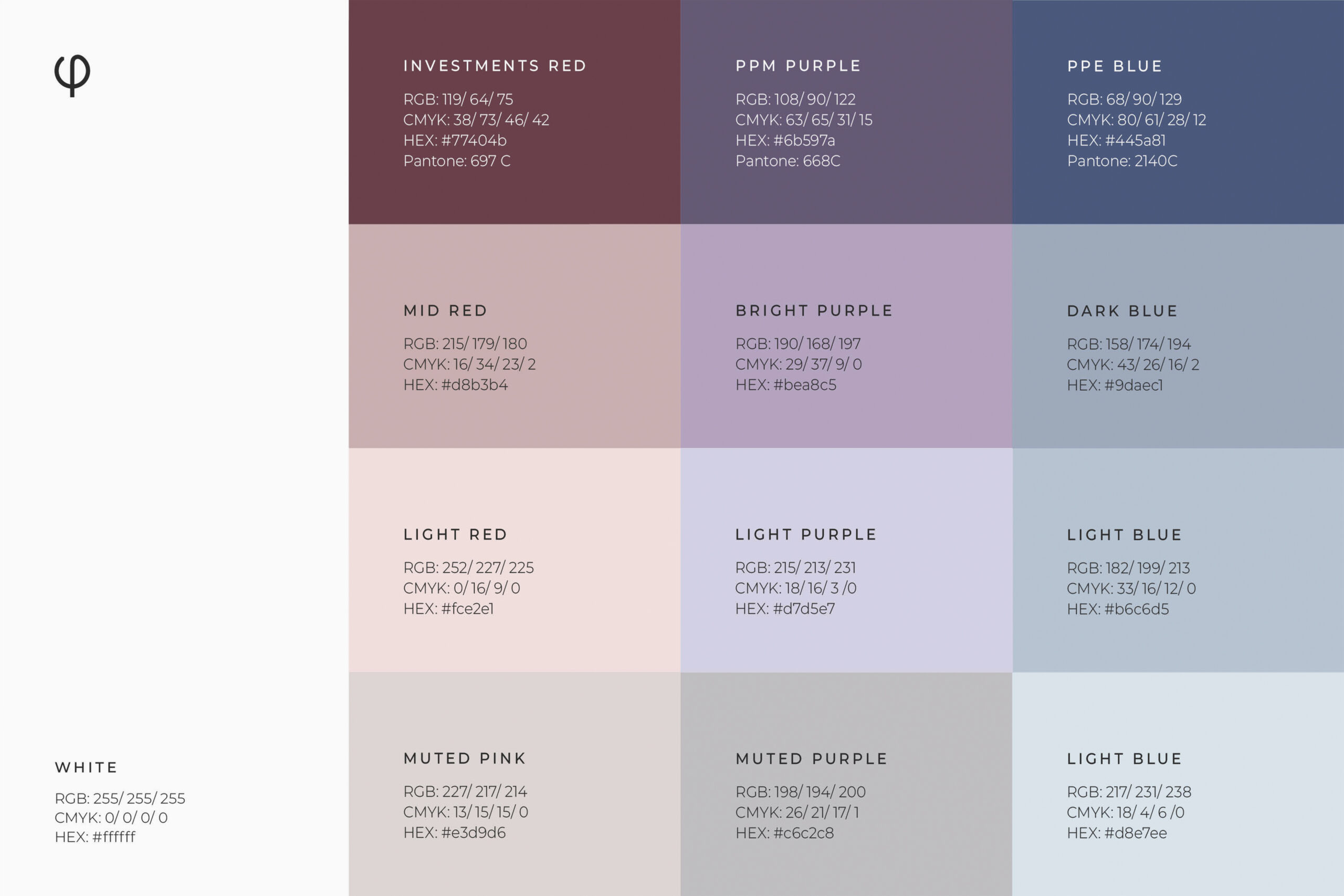
To create, develop and deliver a brand for the entire Puma Group. This would include Puma Investments, Puma Private Equity and Puma Property Finance. A brand that was broad enough for each part of the group to present their own stories and personality, but strong enough that it always looked like it was built from the same foundations.
The Process
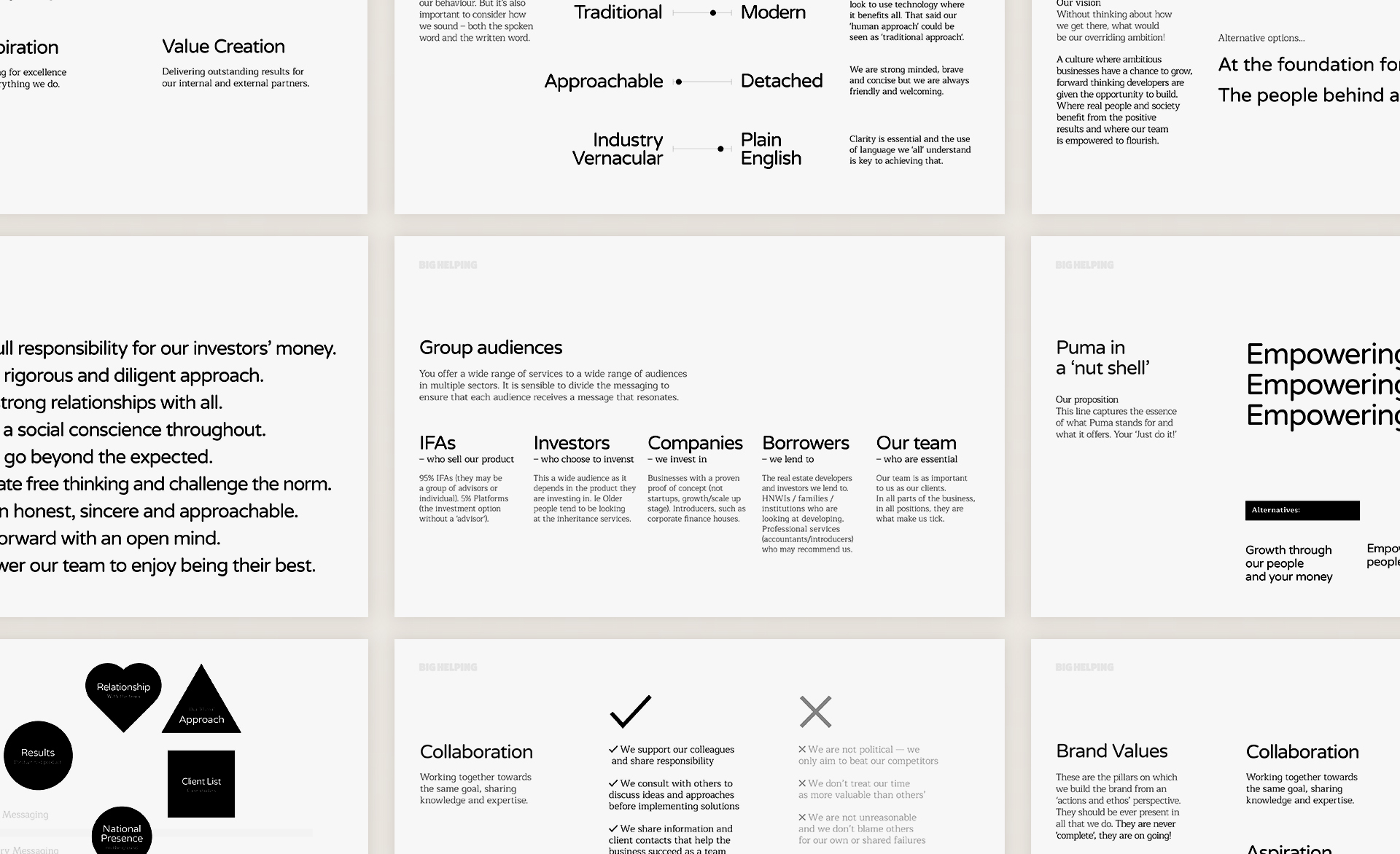
We approached this project like we do them all, by looking at the stories we needed to tell. We carried out extensive research internally and externally and worked on the positioning of the Group. Including tone of voice, core messages, brand statement and proposition.
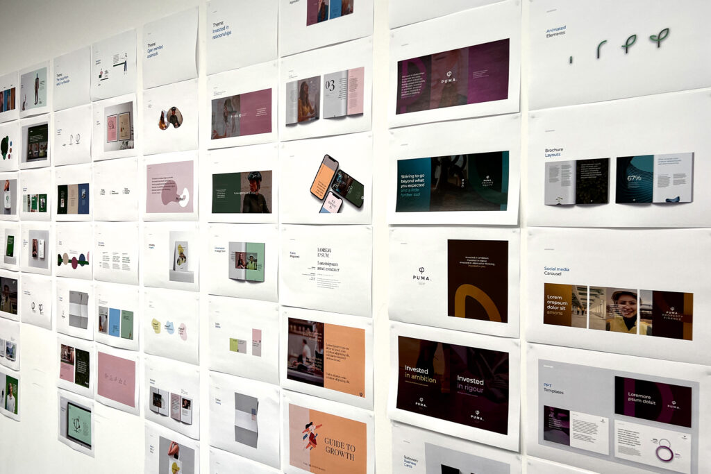
Visual narrative
Once we’d cracked the written narrative we focused on the design concepts. Developing a range of themes to give a thorough view of what each one would look like across a wide selection of branded elements. From this we developed the chosen concepts and the final brand grow from there.
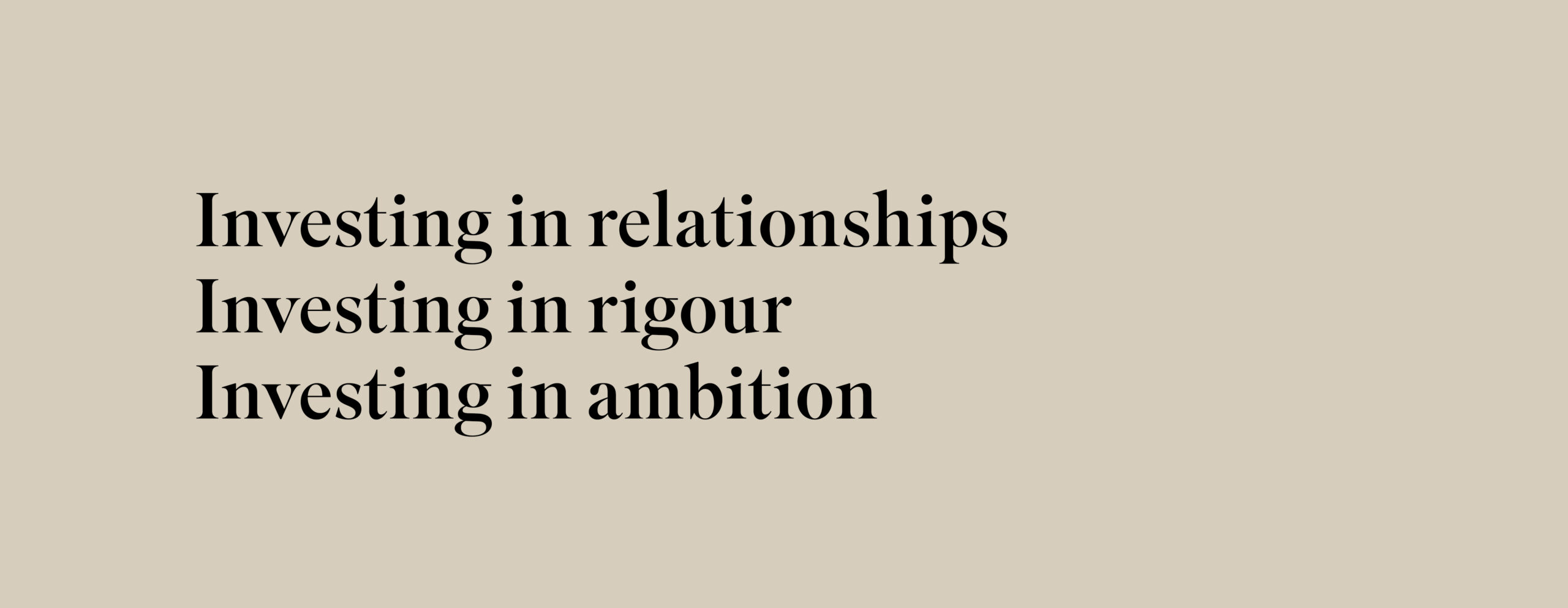
The Proposition
Where a personal touch meets a drive to succeed.
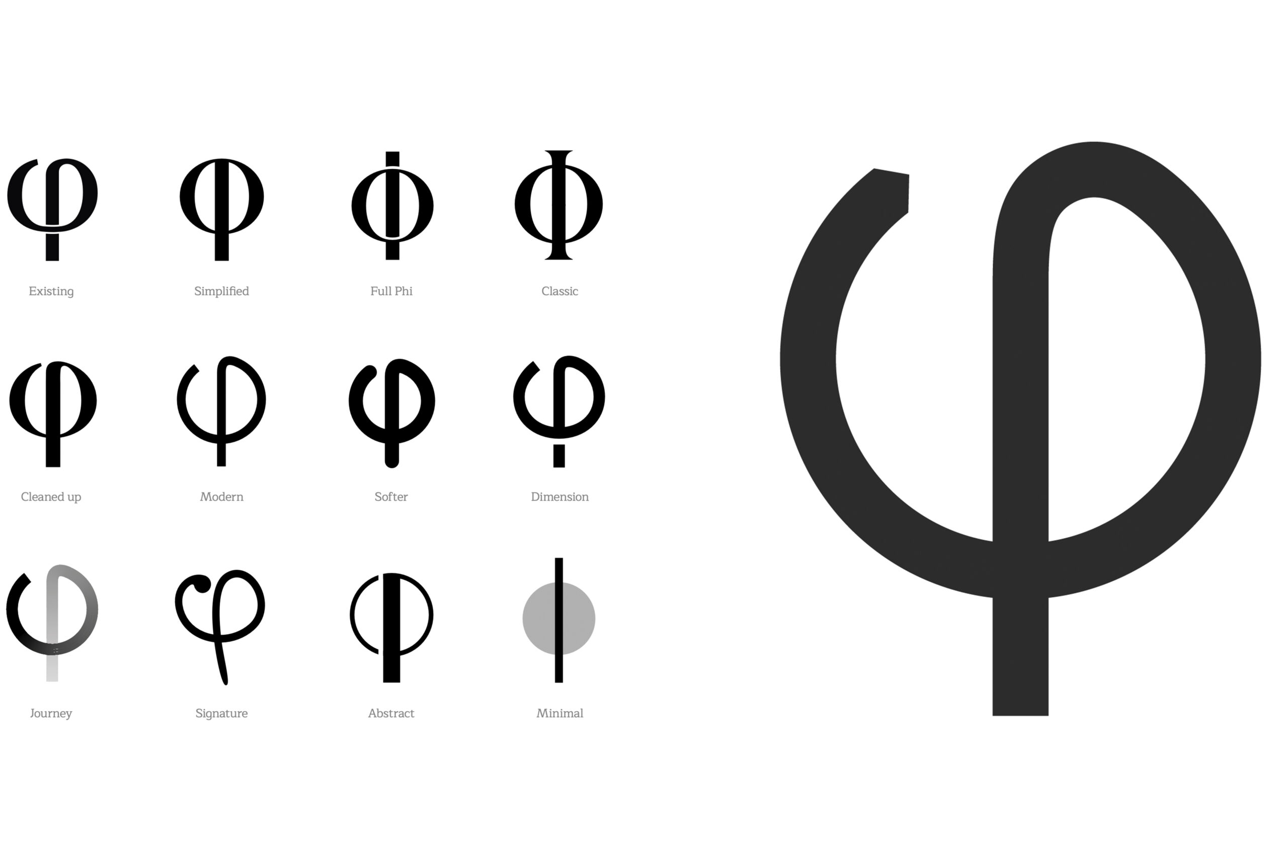
The Phi
This was a key part of the previous brand. It stands for excellence and that core message is still very relevant to the business today. We simplified and modernised it and gave it a sense of direction and purpose.

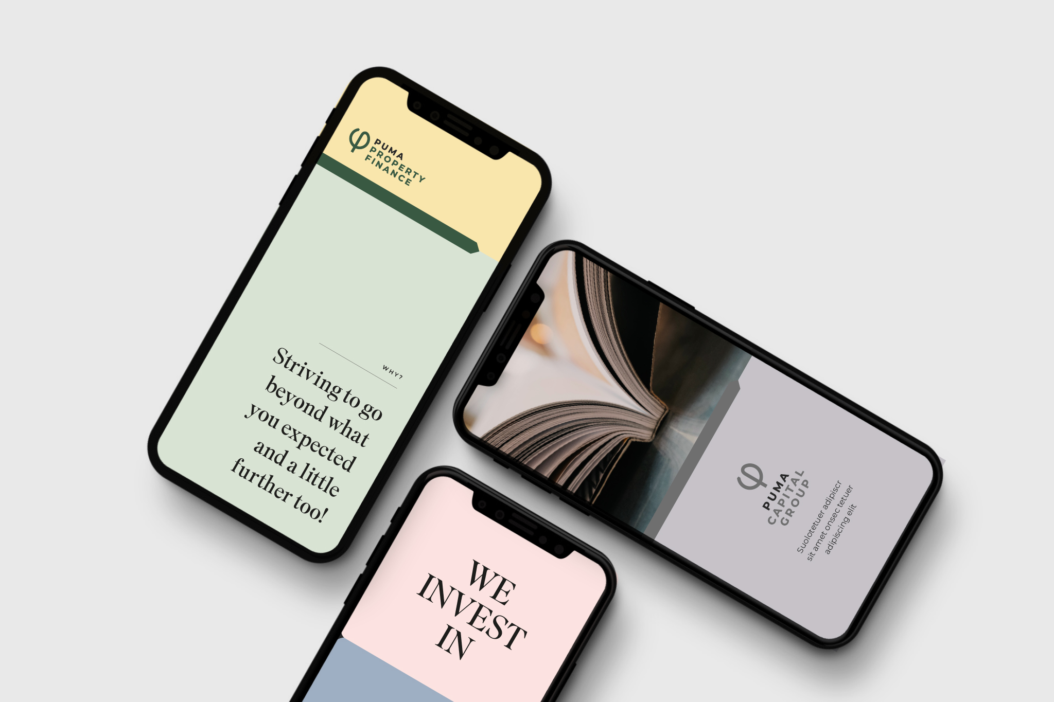
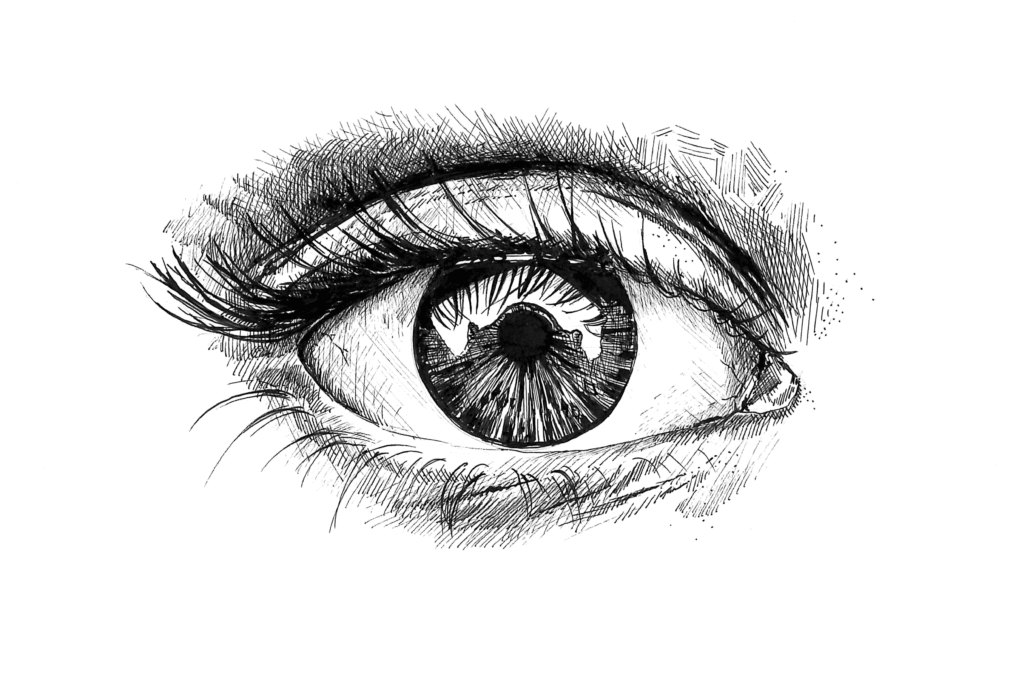
Photography is core to most brands. Puma is no exception, but we wanted to find a way of owning the images, a way that reflected the brand positioning. We stayed clear of corporate head shots and images of the London skyline!


Puma People
The team should feel ‘human’ and ‘real’. A form of relaxed posed.


Amplified Imagery
They signify Puma Capital Group’s aim to amplify prosperity.
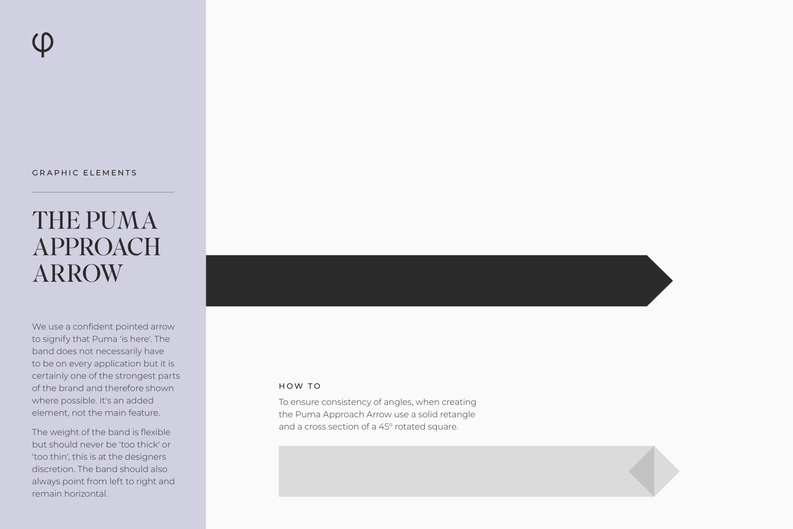
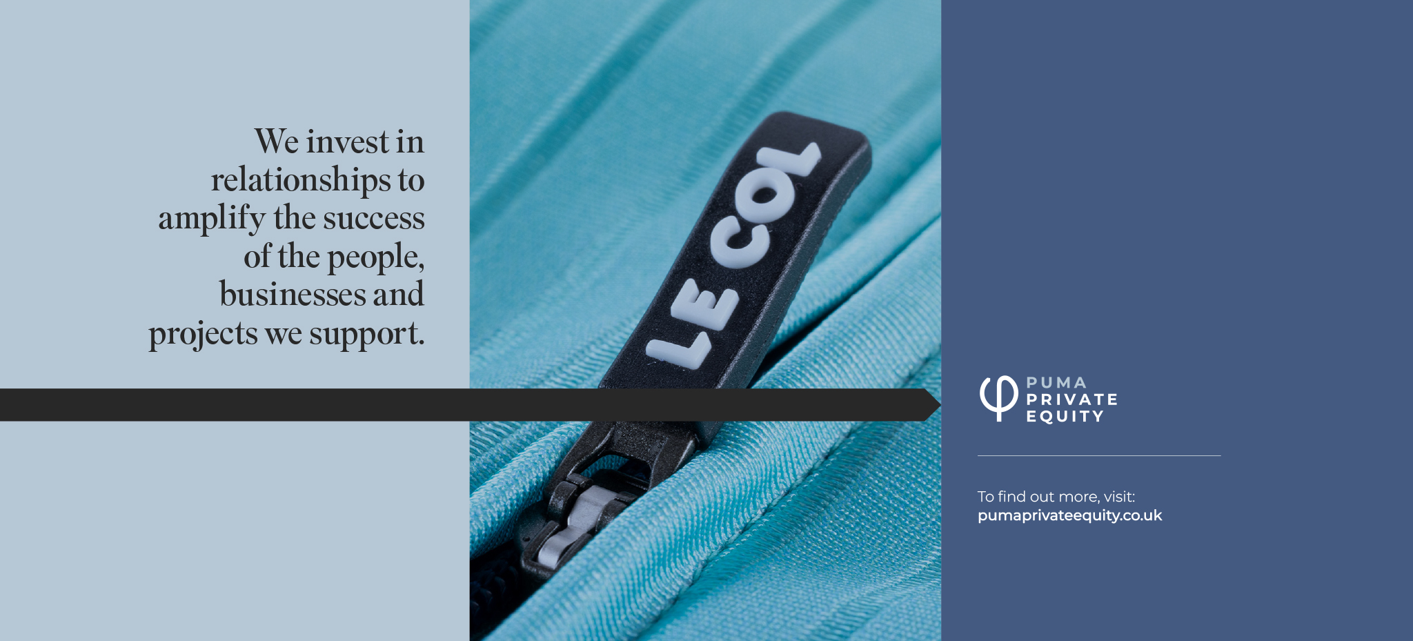
Visualising an approach
The arrow helps highlight messages and is a visual sign that ‘Puma was here’. It is a core part of the brand ingredients.

Creating premium
Little touches make a big difference. In this case a simply introduction of a ruled line helps create a premium feel to the design.

Icon Set
A extensive library of icons has been created with the Puma Approach Arrow running through them all.
Bespoke Illustrations
We commissioned artist Sarah Harvey to create a range of hand drawn illustrations to support core values and popular narratives.
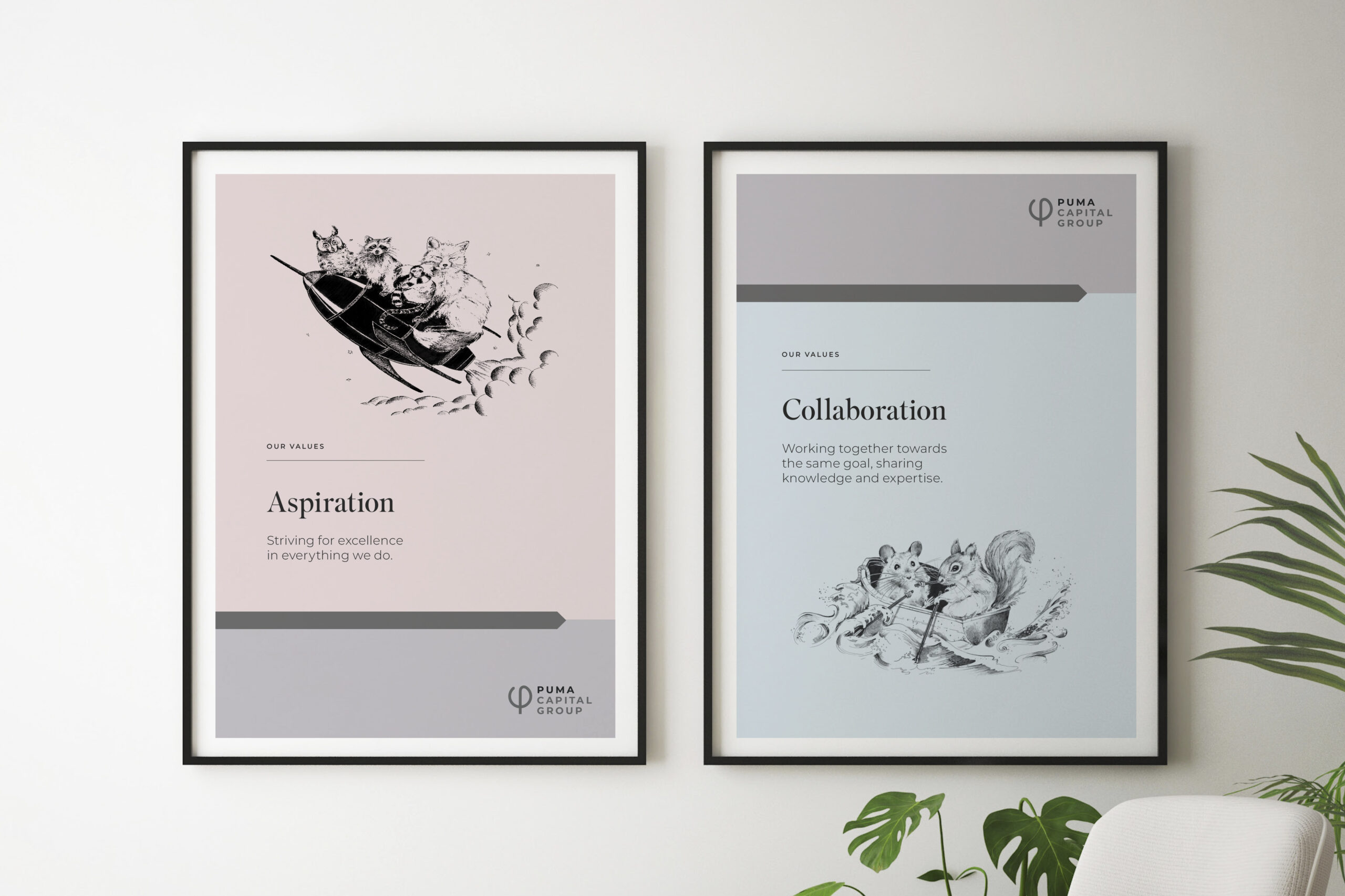
Ensuring the values are remembered
Each value has it’s very own hand drawn illustration.
The Result
In truth it’s too early to tell what results the rebrand
will have as it has yet to be fully launched!
The Puma team are delighted with the new brand but we’ll only be delighted when we see it all fully rolled out and doing what it’s design to do – have a positive impact!